And now for the award winners. I cannot even image how one would choose among this incredible collection of artwork but award jurist Marcia Young was charged with this impossible task. Here are the results…
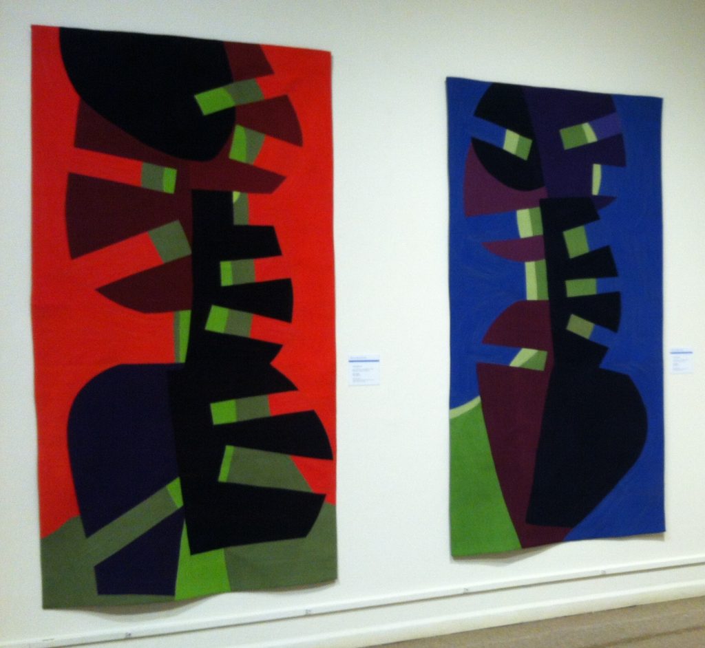
The Shirley Hastedt Award: Red Jive and Blue Jive by Gerri Spilka…
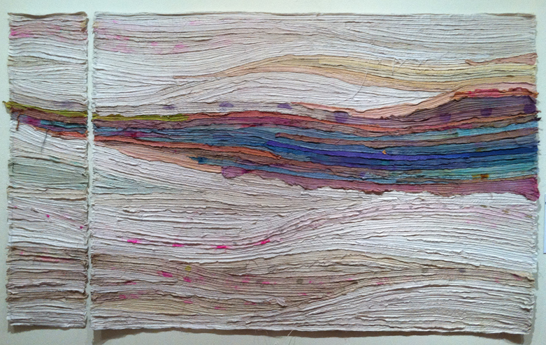
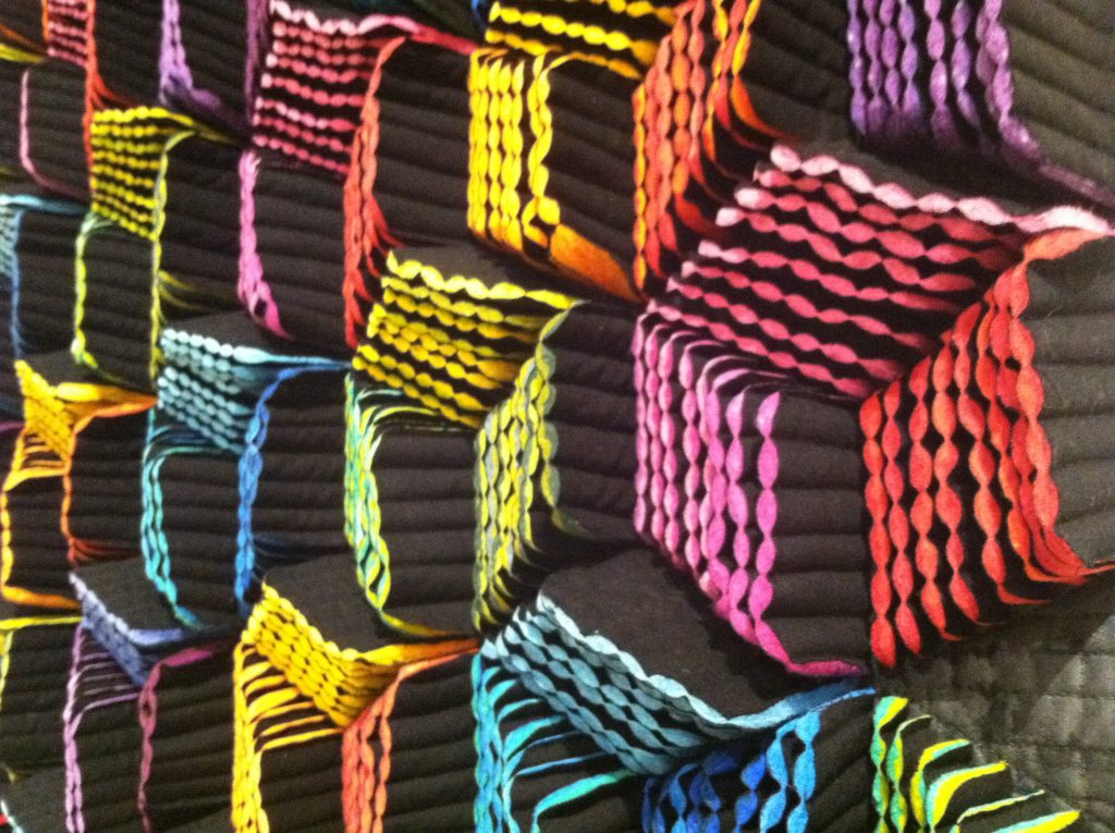
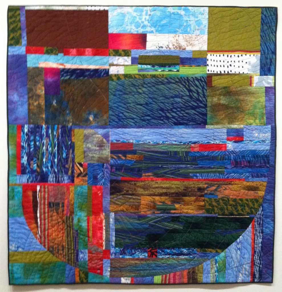
The Catherine Hastedt Award for Hand Workmanship: Compaction & Drift by Shea Wilkinson…
The Schweinfurth Award for Excellence: Tumbling by Naomi Velasquez, side angle detail below…
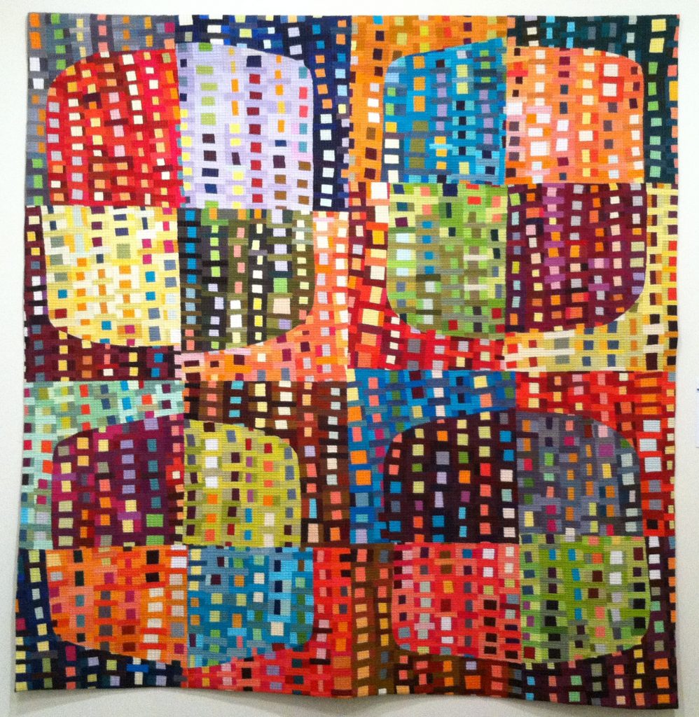
Juror’s Choice: Frameworks IV by Julia Graziano…
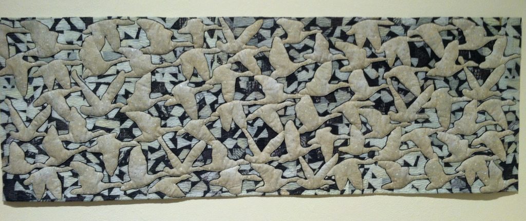
Juror’s Choice: Flying Geese- One Voice by Vicki Conley…
Juror’s Choice: Breakthrough by Elizabeth Busch…
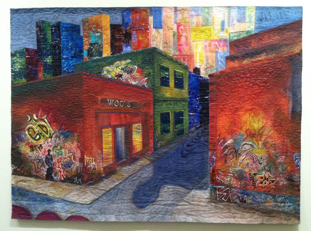
Award for Surface Design: Griffith and Broadway by Marian Zielinski…
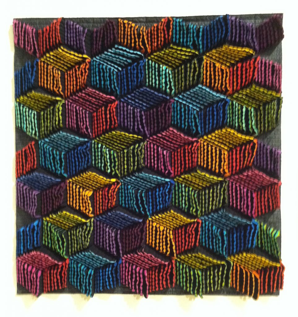
Third Prize: Container by Kathy Ford…
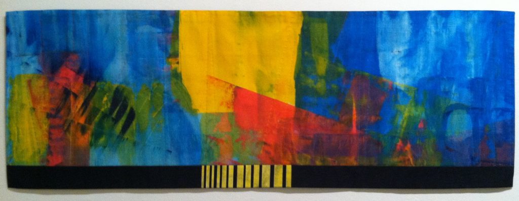
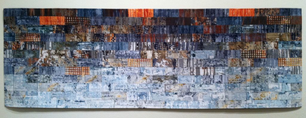
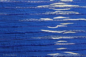
Second Prize: Infinity IV by Elena Stokes…oh, that’s me! I’m so honored!!!

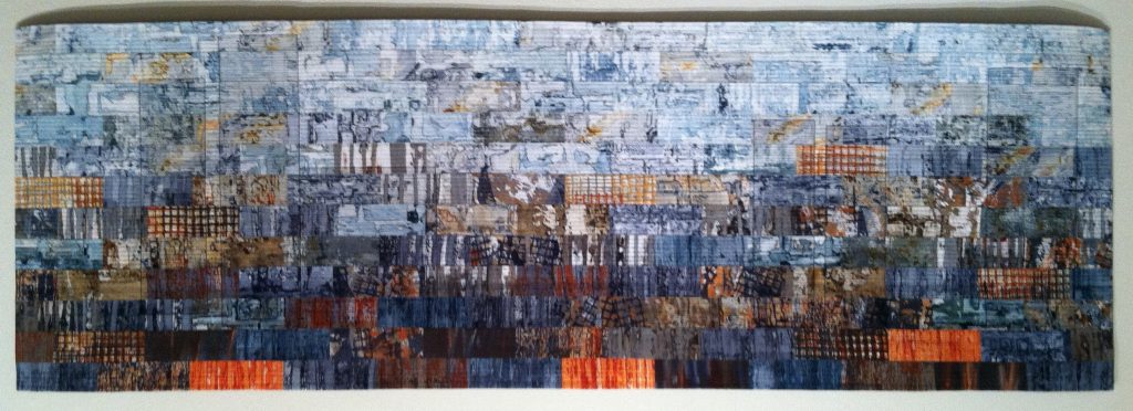
So, I’ve been asked to talk about why I split the design into a diptych and its significance. What meaning was I trying to convey? Well, you all know the expression ‘What came first, the chicken or the egg’? Well, if the egg is the idea and the chicken is what grew up out of it, I’m afraid the chicken came first.
When I prepare for my next project, I cut and prep my batting, sort of like prepping a canvas for paint. I cut it to size, iron on a fusible to both sides, fuse fabric to the back, then pin it to my design wall. I had prepped a 72 inch wide piece of batting in contemplation of my next project when a challenge came up in my guild. I only participate in challenges like that if they can work into my body of work and this one did. It was a proposed exhibition in partnership with the Nurture Nature Center in Easton, Pa whose focus that year was Weather. That theme worked well with my body of work and I decided to build upon my Infinity series incorporating a feeling of Wind. The only catch was it could be no wider than 60 inches. So, I decided to cut 12 inches off my prepped batting. I figured it could be cut up into 12 inch squares for small work.
As I worked on the design, the tapering waves were very effective and beautiful but I realized the main swath of color seemed off because it came to a blunt end at the edge of the quilt. I felt like it needed to continue to a point. Then I looked at the discarded 12 inch section and thought ‘Why not? Try it. It’ll either look really stupid or really cool.’ Well, as you can see, it looks pretty cool. It’s an odd place for split but somehow it works visually and, as someone said at the QAQ reception, it looks mysterious.
Lots of layered meaning emerged as well – the sweeping horizon line signifying the unending process of transformation; the winds of change that shape our lives; seeds blowing to far-off fertile lands. I have a subtitle for it, Like Seeds to the Wind, but mostly it’s about my Infinity series.
And, that’s the story of how the chicken came first and the egg of ideas and meaning came afterwards.
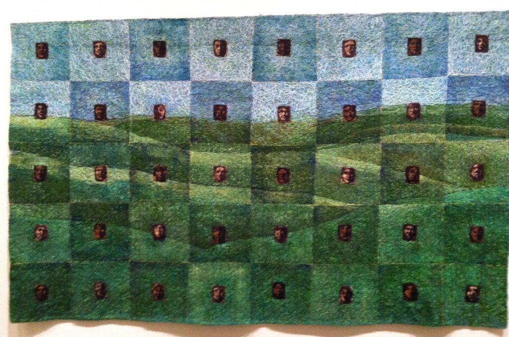
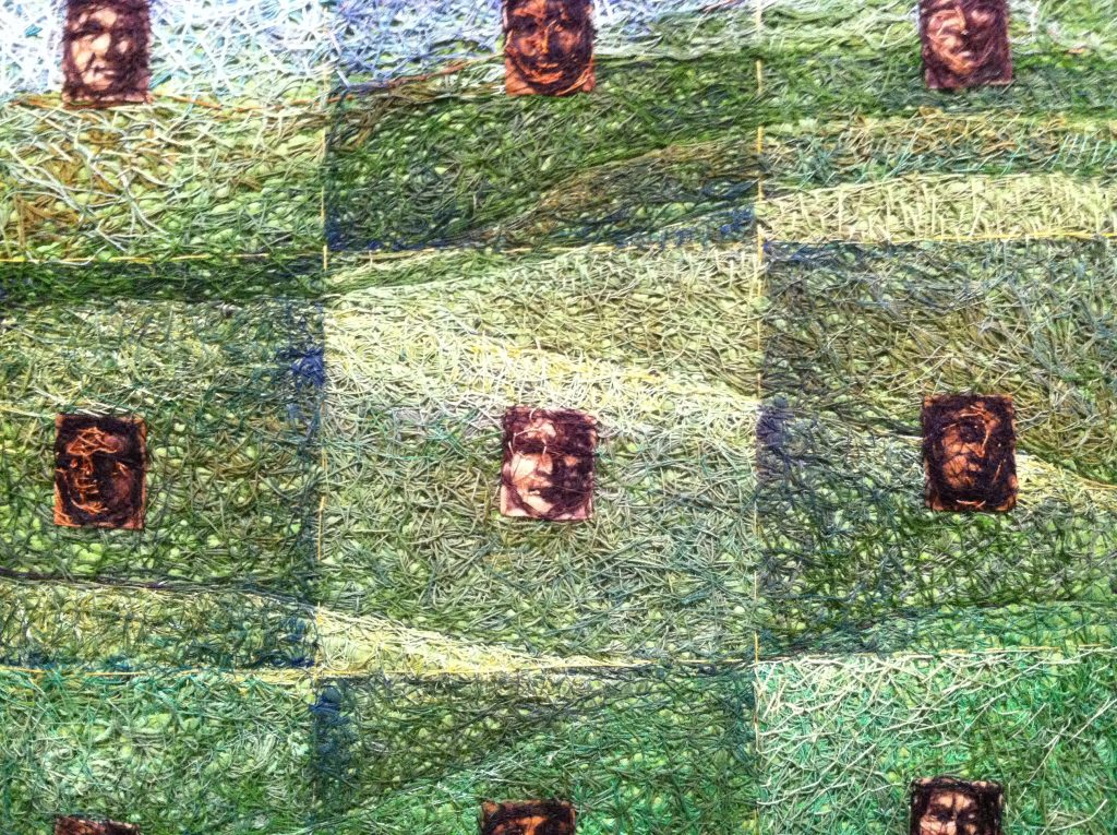
First Prize: People of the Wind by Shin-hee Chin, detail of intense stitchwork below…
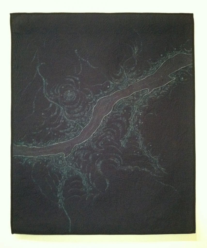
Best of Show: Ruins 1 by Leah Higgins…
Funny story here, above is Ruins 1 as it was displayed at the Schweinfurth opening reception. But, I saw that artist Leah Higgins’ post on Facebook announcing her Best of Show award and the picture she posted displayed it inverted, as I clumsily did below. The funny thing is, during the weekend I was in conversation with a fellow artist who said her work had been hung upside down. It seems the bottom sleeve intended for a secondary slat to weight the bottom was mistook for the top hanging sleeve. They didn’t notice the label at the bottom right to guide them as to what was top and bottom. Well, it seems that’s what must have happened here, I’m guessing. It’s a lesson for us all – be careful of those bottom sleeves, they might get your work hung upside down! Always supply instructions as to the top of quilt if you use a bottom sleeve.
By the way, I did let Leah know about the inversion of her work and she contacted the Schweinfurth Art Center.
I hope you enjoyed seeing my pictures of the show but they really don’t do justice to the work. If you can get there, go see them in person!
Ellen Heath
2 Nov 2017These are wonderful! Thank you for sharing. Your explanation about your diptych made me laugh. “People of the Wind” is so beautiful and a little bit sad. I’d love to know more about it.
elena
2 Nov 2017Ellen, so often an unanticipated challenge or accident lays the groundwork for inspired choices that result in elevating the work. And, this piece ended up with a flexibility in size when submitting to exhibits. The 60 inch piece has been in two shows now and if I ever run across and show with a 12 inch width limit, I’ve got just the piece! lol
Yes, People of the Wind is stunning. It’s one of my favorites of the show.I’ll summarize her statement: It’s about marginalized and forgotten groups in society, specifically, the Native Americans. The title People of the Wind is a rough translation of Kansas and features a collection of portraits of various Native Americans. She goes on to say how eighteenth century Europeans romanticized them, dubbing them ‘noble savages’. She wanted to emphasize their nobility as well as the hardships they endured. The green stitching for the grassland was significant to depict the prairie in which the lived.
Martha Ressler
2 Nov 2017Thank you for all of these. So well organized and coherent. And beautiful! And congratulations, again, to you!
Ann E Ruthsdottir
2 Nov 2017Congratulations. Thank you for these posts of WONDERFUL ARTISTIC works. Do you know if Naomi Velasquez is the person who first used this technique at Houston several years ago? At the time, this person won the ‘Young Person award’. It was not called that, but it was to encourage young people to keep on with their work. I think it was 4 or 5 years ago. Very similar to this quilt.
elena
2 Nov 2017Thank you, Martha!
Ann, thank you. No, I’m sorry, I don’t know of the quilt or quilter at Houston years ago but if it’s that similar, I would guess it might be the same. But, I don’t know for sure.
Ann E Ruthsdottir
2 Nov 2017I would really like to know if it is the original artist who did this at Houston or a copy cat.
I had a quilt copied by someone more skilled and KNOWN, so I am extra aware of this happening. I do hope it is the original quilter.
LOVE this show. It is SPECTACULAR!
Not sure how I could see it in person? Houston is more accessible because it is organized to be so. I would also love to see Quilt National. This year I did not even see any quilts posted. So disappointing for those of us who could not visit in person.
elena
2 Nov 2017Ann, it is very easy to research any artist, just google their name. I readily found her on the internet. Her full name is Naomi S. Adams Velasquez and she has been exhibiting extensively for years. Here is a link where you can read all about her. http://killerbeedesigns.com/wordpress/about-naomi/ You may have to copy and paste this in your browser. Be sure to click the link on her About page that goes to her full cv where she lists everything she’s been in, and it’s lot, including several Houston Festivals and Quilt National.
I feel confident she is the artist you saw in Houston.